

In grocery and everyday-essentials retail, shopper behaviour looks nothing like electronics or fashion. People buy the same basket over and over: milk, bread, eggs, water, a favourite yoghurt, laundry detergent, vitamins, pet food. That builds a habit and a ritual.
The product manager’s job is to spot that behaviour and shorten the path from need to repeat purchase as much as possible. The “Repeat last order” mechanic (Repeat Last Purchase) is not just another feature — it is a strong lever on the core business metrics:
* A shorter customer journey: you remove the search, the catalogue browsing and the endless scrolling. The order takes two or three taps.
* Revenue growth (ARPU): making the process easier lifts purchase conversion and order frequency. A customer who does not want to spend time choosing is far more likely to buy on impulse if you offer it at the right moment.
* Better retention and LTV: you become the convenient service that “remembers” the customer’s preferences. That builds loyalty and the habit of using your app for regular shopping.
* More repeat purchases: the mechanic directly drives the second, third and tenth order, turning a one-off buyer into a regular.
Here is a practical guide to the ways you can implement it.
Placement options and what each one does
Where you put the “Repeat order” control matters a great deal. It depends on the point of the journey where you want to intercept the user. A/B test every option — but with a clear hypothesis behind each one.
1. A dedicated tab on the home screen
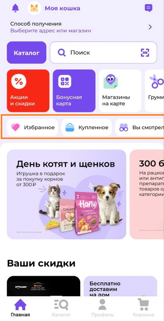
What it is: a dedicated area — a horizontal banner, a whole block, or a standalone button at the top of the app or site home screen.
Pros:
* Maximum visibility. The user sees the offer immediately after opening the app.
* Suits the “lazy” scenario, where the user opens the app with no clear plan of what they need.
Cons:
* Takes up valuable space on your most important screen. It can clash with other promotions.
* It can be irrelevant to new users or to someone who has only just placed a first order.
Recommendation algorithm: use the Last Purchase strategy. In Custom Rules, require that products in every slot are in stock. The configuration usually looks like this.
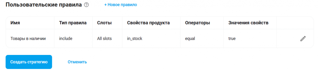
Tips: target this campaign. Show the block only to customers who have an order history and who have opened the app at least once in the last month.
2. An entry in the catalogue menu
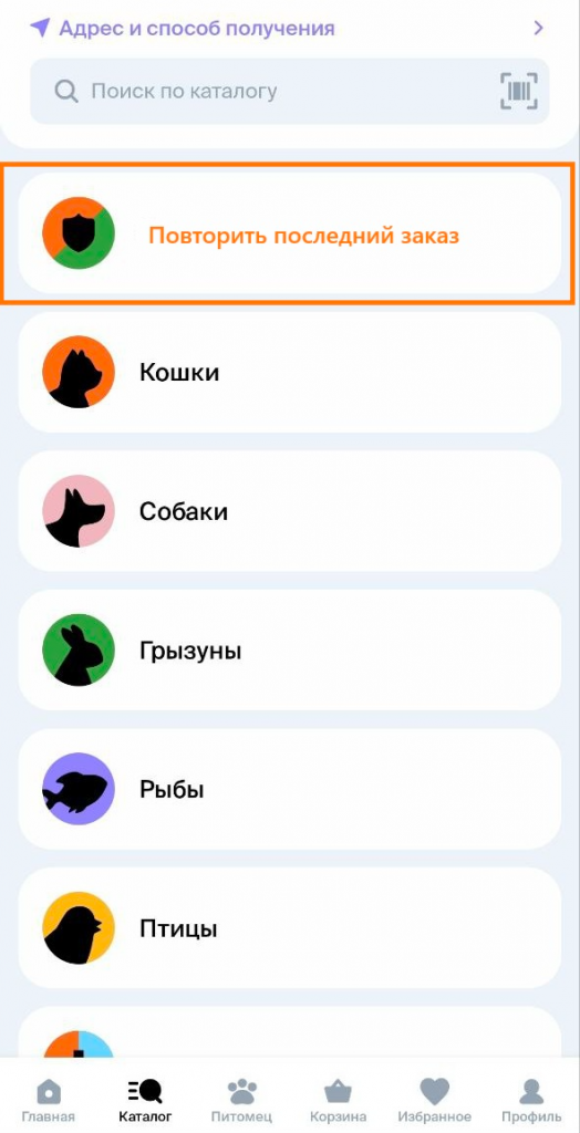
What it is: a “Repeat last order” item in the list of product categories (after “Milk and cheese”, “Meat and poultry” and so on).
Pros:
* A very natural, logical place. A user who is used to finding products through the catalogue will definitely see it.
* It does not clutter the home screen.
Cons:
* Less visible than a banner on the home screen. The user may never open the catalogue.
Recommendation algorithm: use the Last Purchase strategy. In Custom Rules, require that products in every slot are in stock. The configuration usually looks like this.
Tips: this one is a must-have. Ship it first — it is basic convenience. Target the campaign and show the block only to customers with an order history.
3. A bottom sheet for returning shoppers
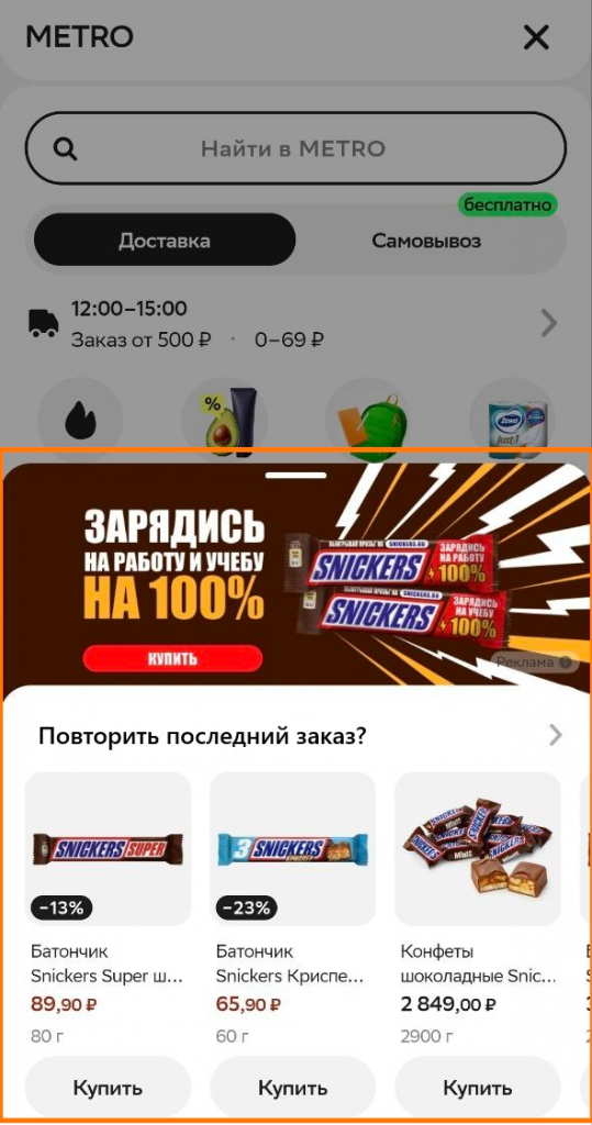
What it is: a sheet that slides up from the bottom of the screen when the user returns to the app a few days after their last order with an empty cart.
A bottom sheet implementation can contain:
- a banner plus a call to action to place the order;
- product recommendations from the last order. Careful — the products must be in stock.
Pros:
* High relevance and personalization. You catch the perfect moment: the user has most likely come back for another round of their usual items.
* It provokes action. The offer appears in context and does not get in the way on other screens.
Cons:
* It can annoy if shown too often or at the wrong moment (right after an order, for instance).
Recommendation algorithm: use the Last Purchase strategy. In Custom Rules, require that products in every slot are in stock. The configuration usually looks like this.
Tips: the most powerful instrument for growing repeat purchases. Set the trigger to “user is 3+ days past their last order + opened the home screen + cart is empty”. Always make it easy to dismiss.
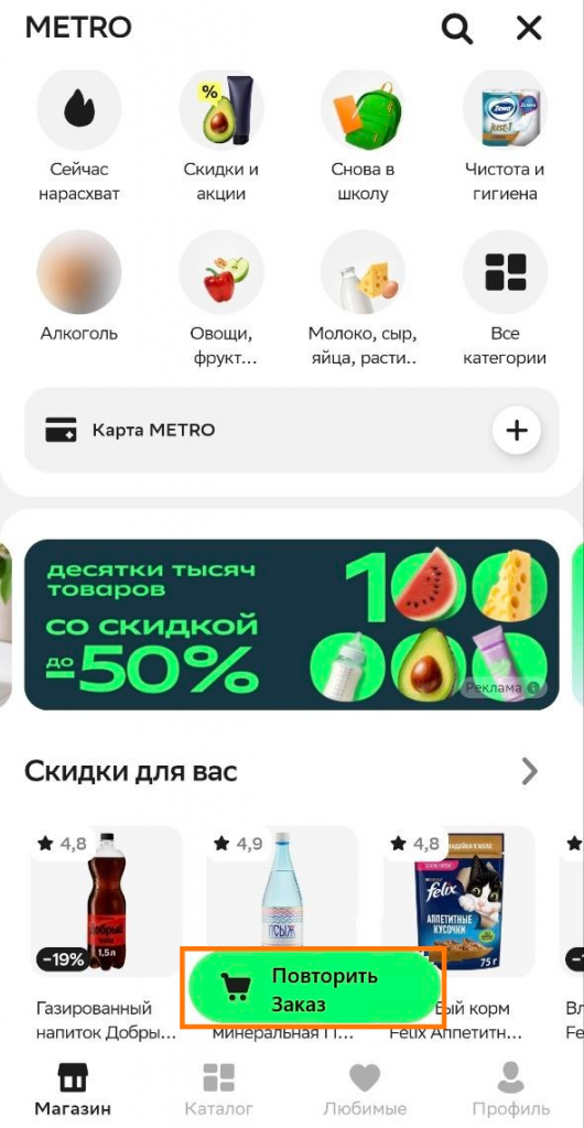
4. A floating action button (FAB)
What it is: a floating button pinned on top of the interface — in the bottom-right corner, or centred.
Pros:
* Always in view. Available on any screen — home, catalogue, product page.
* It stays present without taking much space.
Cons:
* It can cover important interface elements.
* It can feel intrusive if the design is not thought through.
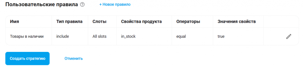
Recommendation algorithm: use the Last Purchase strategy. In Custom Rules, require that products in every slot are in stock. The configuration usually looks like this.
Tips:
- Use a stylistically neutral icon (a circular arrow works). A good solution for advanced users who value speed.
- Cap the number of impressions per user — once a week or once a session, for example.
- Limit the screens where the option appears, for instance to the home screen only.
- Make sure the button does NOT cover other elements.
- Place it where it does not interfere with buying or browsing the catalogue.
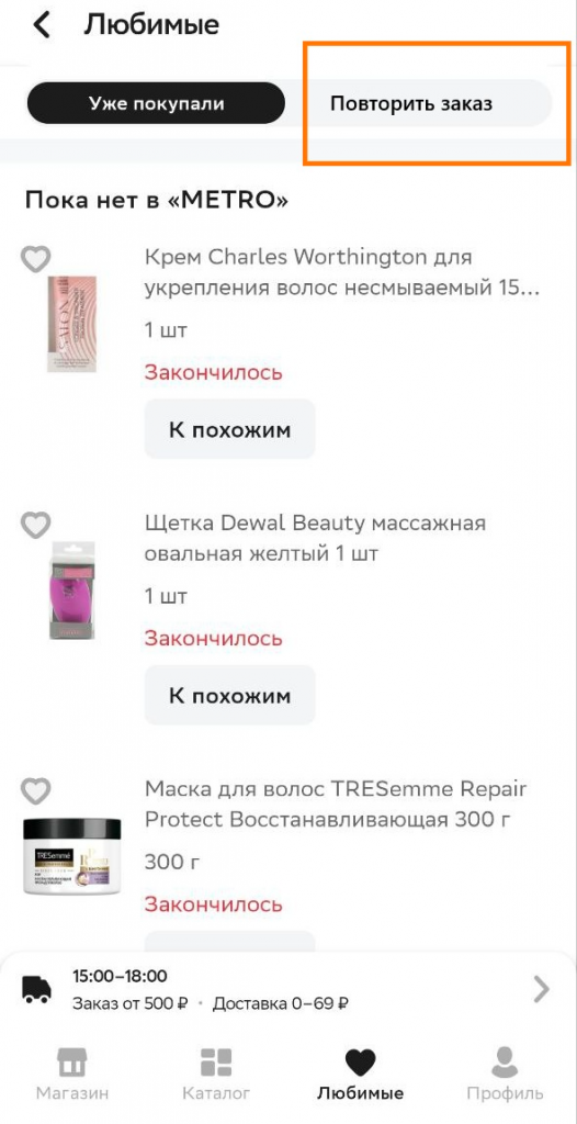
5. The account area / favourites page
What it is: the “My orders” section, or a separate tab in the user profile.
Pros:
* The obvious, expected place. A user who wants to repeat an order will logically go to their order history.
* It does not interfere with the main shopping flow.
Cons:
* Low visibility for impulse use. The mechanic does not prompt the action; it helps someone who has already decided to act.
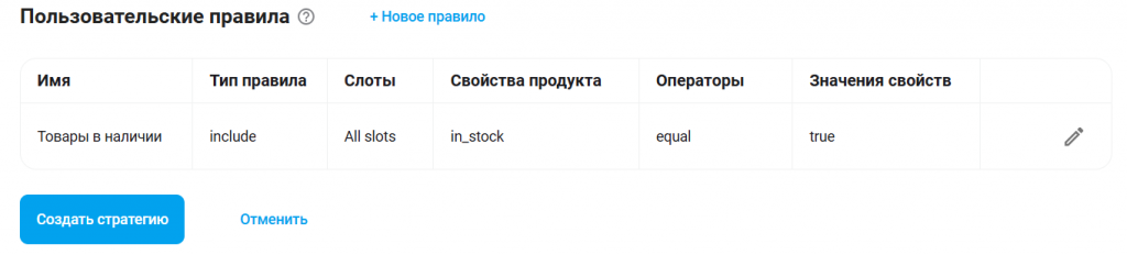
Recommendation algorithm: use the Last Purchase strategy. In Custom Rules, require that products in every slot are in stock. The configuration usually looks like this.
Tips: this is the baseline you must ship. But do not stop there — on its own it will not move growth.
Behaviour: what happens after the click
Whichever placement you choose, the flow after the click should be the same — fast and obvious.
1. The user taps an element that says “Repeat last order”, “Buy again” or similar.
2. The system opens a screen (a new page, a popup, a bottom sheet) headed “Your last order”.
3. That screen lists products built by the Last Purchase strategy. It is not a blind copy of the previous cart. It is a smart list that has to account for:
* Availability. If an item is out of stock, do not show it — the user cannot repeat that order.
* Price. The current price must be shown, not the old one.
* Selectability. The user must be able to untick items they do not want in this order (they already bought the milk at the corner shop).
4. The action button (“Add to cart”). On tap, every selected item is added to the cart in the specified quantity.
5. Moving to the cart. After adding, the system either redirects to the cart automatically or shows a “Items added to cart” notice with a “Go to checkout” button.
Summary and rollout recommendations
Do not try to build every option at once. Work iteratively:
1. Step 0: ship the feature in the account area. That is your base.
2. Step 1: add the entry to the catalogue menu. That widens visibility.
3. Step 2: run an A/B test with a triggered bottom sheet for returning users. That is your main candidate for moving metrics.
4. Step 3: using the data and the test results, experiment with home-screen elements and floating buttons.
Always set goals and measure: track CTR on the element, conversion to add-to-cart and — most importantly — conversion to a completed repeat order initiated through the mechanic.
This feature is one of the pillars that convenience and profitability rest on in any business with a high share of repeat orders. Good luck shipping it.


