The goal
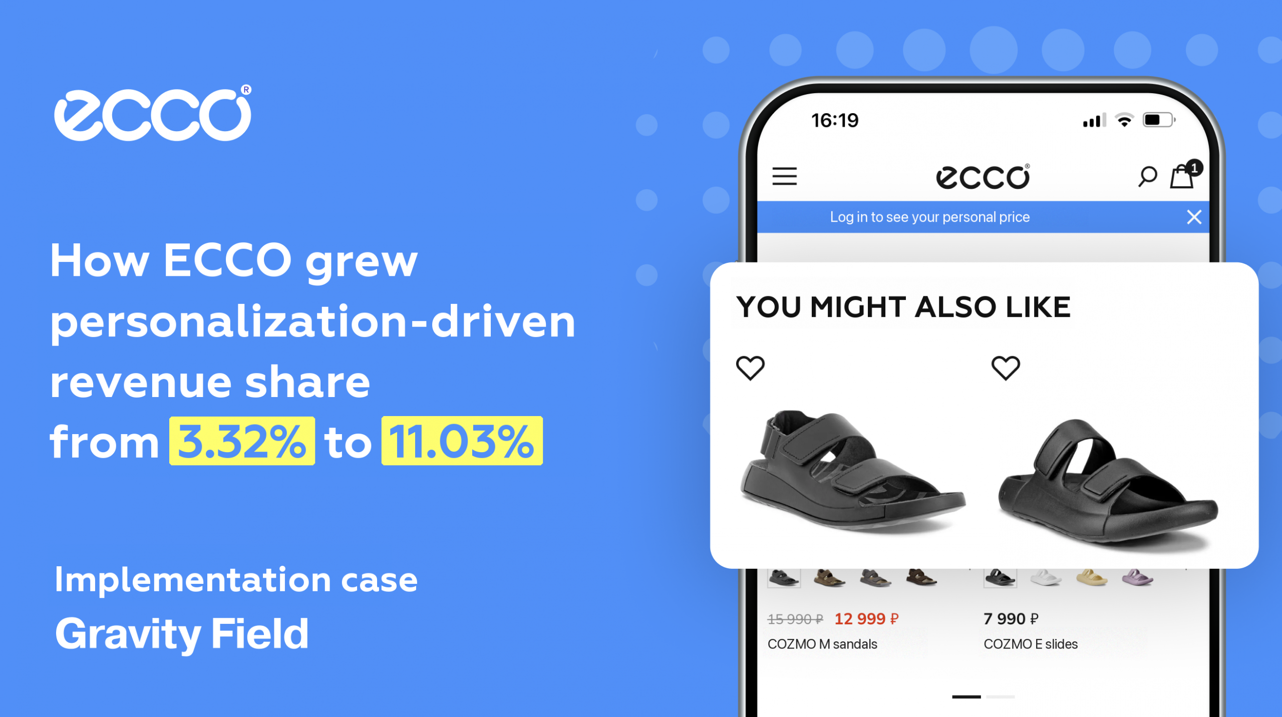
In 2024 the e-commerce team at ECCO started working with Gravity Field on a very concrete goal — hold order volume while prices were going up. The bet was personalization: the team was looking for a way to launch hypotheses fast — about where and to whom recommendations should be shown so that they paid off in money, not in clicks.
Over three quarters ECCO tripled the share of revenue attributable to these mechanics — from 3.32% to 11.03%.
Who ran the project
- Alexander Blagovisny, eCom Director — owner of the business goals;
- Evgeny Petrov, Product Manager — responsible for launching hypotheses and for analytics;
- Alisa, integration coordinator — made sure tracking and the SDK were correct;
- the QA team and a designer — brought in when campaigns were being configured.
How the team got there
📱 1. A carousel on the mobile home page for returning users (paid traffic)
Context:
ECCO gets a substantial volume of mobile traffic from paid channels. Internal analytics showed that users came back after the first visit but did not buy. The problem was that returning users from ad campaigns were shown generic selections — the same ones first-time visitors saw. That hurt engagement and conversion.
What they did:
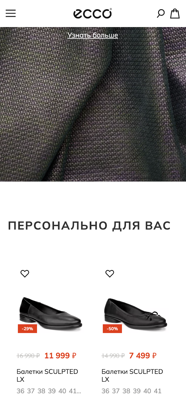
A horizontal carousel with personalized recommendations was added to the mobile home page. It was shown only to the audience returning from advertising sources. The algorithm was User Affinity, which picks products from a user’s interaction history (views, add-to-carts, orders).
Result:
- Purchase conversion grew by +11.55%
- Revenue increased by +8.21%
- Add-to-cart — +4.02%
- Statistical significance — 95%
Why it worked: users saw products matching their preferences right on the first screen. They did not have to hunt for the models they were interested in through the catalogue again.
What was used:
- segmentation by traffic source (advertising) and user type (returning);
- the Affinity algorithm, which learns from a specific user’s actions (views, purchases, add-to-carts);
- a control group and an A/B test with automatic effect calculation.
👤 2. A carousel on the home page for new users
Context:
The first visit matters most: if a user is not hooked by the first few screens, the odds are they will not come back. The job was to give a new user a relevant — but not overwhelming — number of products.
What they did:
The team set up the same recommendation carousel, but applied a different algorithm to the new audience: Popular + Recently Viewed. It picked up the user’s interest after their first action (a scroll, or an interaction with a product card, for example). The widget was not shown immediately, so as not to overload the first screen.
Result:
- Purchase conversion — +8.08%
- Average order value — +2.9%
- Revenue — +12.52%
- Statistical significance — 95%
Why it worked: newcomers got their bearings — a selection of popular products other people had already chosen. After the first click they saw products close to the ones they had just engaged with.
What was used:
- the “new users” segment;
- a hybrid of algorithms (Popular + Recently Viewed);
- action-triggered display (a deferred insert after scroll).
🖼 3. A grid widget on the home page (web, organic traffic)
Context:
Organic traffic accounts for a significant share of web sessions but converts worse than paid. The standard recommendation widget at the bottom of the home page was not engaging: users did not scroll that far and did not interact with the block.
What they did:
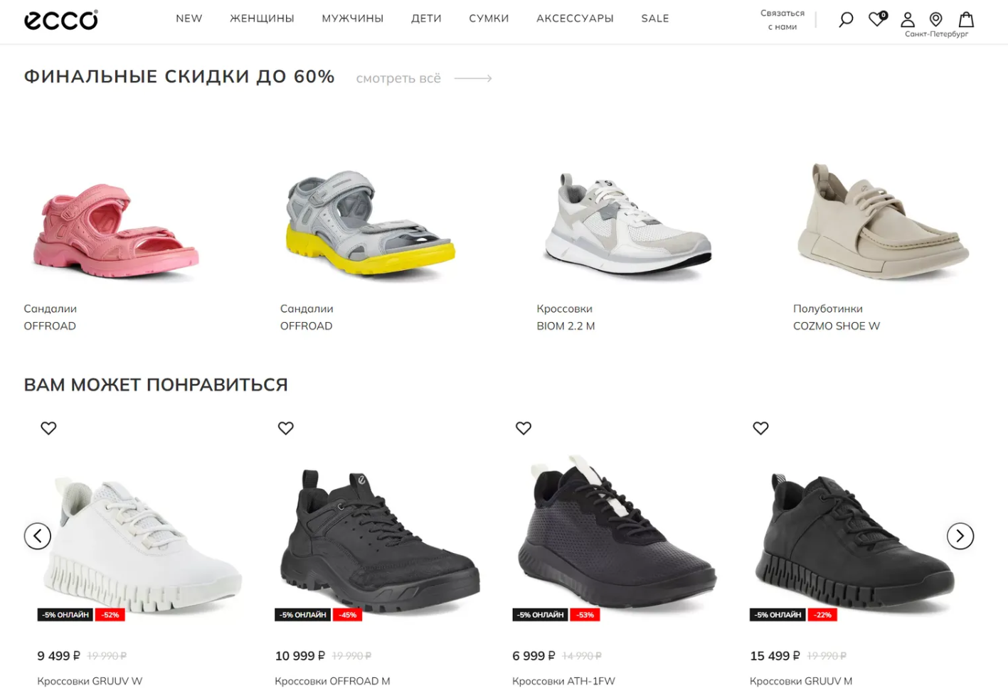
ECCO replaced the recommendation block with a grid widget that scrolls down and has a “Show more” button. The widget gathered a larger set of products, laid them out in the familiar tile format, and loaded the next batch on click.
Result:
- New users: +3.13% conversion, +4.53% revenue
- Returning users: +3.7% conversion, +6.62% revenue
- CTR of the “Show more” button: 9.9%
- Statistical significance — 95%
Why it worked: users scrolled deeper, saw more products and spent more time inside the block. A simple mechanic increased interaction density — without pressure or extra elements.
What was used:
- a grid format instead of the standard carousel;
- a “Show more” button with lazy-load logic;
- action-level analytics (clicks, product loads).
📂 4. Recommendations in the catalogue
Context:
The catalogue is the main source of traffic, but it had no personalization. Every user saw the same product cards, and recommendations, when they appeared at all, sat below the attention zone. The team wanted to find out whether widget position and algorithm affected performance.
What they did:
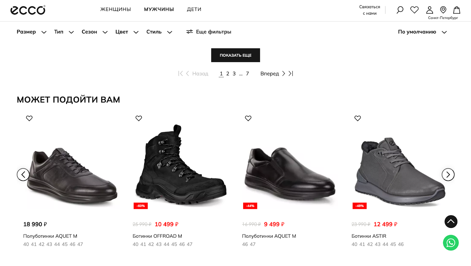
The team built two widget variants and tested them separately on new and returning users. New users saw the block after the third row of products (high visibility); returning users saw it closer to the pagination (at a more mature stage of the decision). The algorithms differed too: “Popular with a high rating” for men, a hybrid of Affinity + Recently Viewed for women.
Result:
- New users: +11.54% conversion, +6.6% revenue
- Returning users: +4.15% conversion, +18.95% revenue
- Average order value (new users): +3.42%
- Add to cart (returning users): +5.01%
- All results at a 95% significance level
Why it worked: the recommendations landed at the moment when the user was already engaged but had not yet made a choice. Different positions and different logic each made a meaningful contribution to revenue.
What was used:
- placing the block in different parts of the page;
- different algorithms per segment (new/returning, men/women);
- a multivariate A/B test (position plus algorithm).
🛒 5. A lighter product card
Context:
The product card in the mobile version was overloaded: too many elements, a small photo, and a text button that was hard to hit. That made navigation difficult, especially on smaller screens.
What they did:
A card variant was adapted to a mobile-first layout:
— the “Add to cart” button was replaced with an icon,
— the colour swatch row was removed,
— the image was enlarged,
— the overall card height was reduced.
The changes were made in the Gravity Field visual editor — without touching the code.
Result:
- Conversion grew by +2.78%
- Average order value — +2.6%
- Revenue — +6.36%
- Statistical significance — 95%
Why it worked: the card became simpler and easier to use. Users understood the product faster and were not distracted by extra elements. The interface stopped getting in the way of the action.
What was used:
- a reworked product card format: elements removed, photo enlarged, button replaced with an icon;
- an A/B test with a fixed control group;
- analysis of the impact on revenue and AOV.
⚙️ Gravity Field capabilities used on the ECCO project
The ECCO team’s work was not about “rolling out a platform” but about the practical use of specific tools. Below is the list of Gravity Field capabilities that made it possible to ship hypotheses, validate them quickly and scale the ones that won.
Targeting and segmentation.
Every campaign was configured for a specific segment: new or returning users, ad traffic, behaviour in the current session.
Flexible algorithms.
Affinity, Popularity and Recently Viewed were used both on their own and in fallback chains adapted to the scenario and the segment.
Different widget formats.
Carousels, grids and compact inline blocks — the team picked a format for each zone: home page, catalogue, product card.
A/B testing.
Every hypothesis ran with a control group. Gravity Field calculated the increment, the average order value, conversion and the significance level.
Built-in analytics.
User actions inside the widgets were tracked automatically, and the results were reconciled with the business funnel in Yandex Metrica.
✅ Results
📈 Revenue attributable to personalized mechanics tripled —
from 3.32% to 11.03% of ECCO’s total revenue over three quarters of working with Gravity Field.
🧩 Every hypothesis was launched by the marketing team — with no developers, no releases and no CMS changes.
⏱ The first result was recorded two weeks after the start.
Three months in, the pessimistic scenario of the ROI model was confirmed.
📊 Measurement followed the real funnel in Yandex Metrica:
listing view → product card → cart → payment.
💡 Instead of a full redesign the team ran a series of pinpoint A/B tests:
on mobile, on the home page and in the catalogue. Only the solutions that proved incremental revenue were scaled.
What you can repeat
- Start with mobile and paid traffic — the effect shows up faster.
- Split algorithms by segment — one widget does not work the same way for everybody.
- Measure revenue, not CTR — and always keep a control group.
- Test widget position, not just the algorithm — where it sits on the page matters as much as the selection logic.
👉 Take the first step: get a free audit of your website or app
We will go through your funnel, show you the growth points and give you recommendations on how personalization can lift conversion and revenue this month.
📍The audit takes a few working days. No commitment — just specific insights and ideas for your project.

