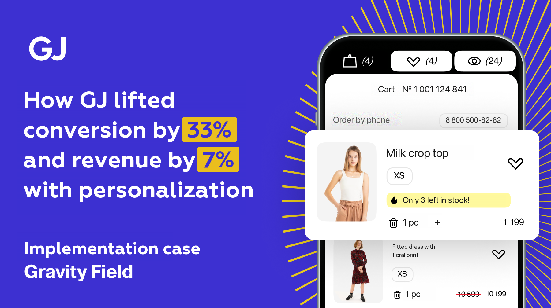
After a website redesign, the Russian fashion brand GJ (Gloria Jeans) ran into a typical but critical problem: despite the refreshed look, conversion dropped and new users got lost in the interface.
The Gloria Jeans team came to Gravity Field with a clear brief: raise conversion and revenue by working on UX and personalized recommendations.
🔍 The goal:
- Engage new users on their very first visit
- Bring loyal customers back to purchasing
- Make every session on the site more productive
💥 Results two months after launch:
- +33.3% conversion among new users — thanks to a personalized menu
- +11.48% purchases — after navigation was improved
- +7.03% revenue — through urgency cues (low stock and social proof)
- +5.77% average number of items in the cart — among returning customers
The problem: after the redesign the site looked better but sold worse
Once the design refresh had shipped, GJ faced three key tasks that needed a fast answer:
1. Better conversion at every stage of the funnel
— from the first visit to a completed purchase.
2. Adapting the CJM (Customer Journey Map) for returning users
— Tuning the experience for the audience arriving from email campaigns.
— Surfacing new arrivals and special promotions.
3. Higher user engagement
— Encouraging add-to-cart actions.
— Increasing the number of transitions to checkout.
The brand was in a familiar spot: the UX had become “visually better” but behaviourally worse.
The situation had to be fixed quickly — without rebuilding everything from scratch.
Why the standard approaches stopped working
- One menu for everyone → different segments are not taken into account
- No adaptation to the behaviour of new versus regular customers
- No urgency and no personal relevance → weak motivation to buy
- Not enough control over how effective changes actually were
The solution: the Gravity Field platform
What the Gravity Field team proposed:
- A personalized menu for new and returning users
- Recommendations based on behaviour and history
- Urgency cues: low stock, social proof, urgency banners
- Sticky key navigation elements
- A/B tests on autopilot — fast hypothesis validation with maximum profit even while the test is running
The solution: rolling out site personalization and recommendations
The Gravity Field growth team proposed a staged approach to GJ.
Step 1. A series of A/B tests that identified the most effective changes to the site’s interface and functionality.
Step 2. Integration of personalized recommendations that took user preferences into account and surfaced the most relevant products.
These three workstreams — menu personalization, sticky key navigation elements and purchase urgency cues — became the foundation of a successful partnership between GJ and Gravity Field. Each step improved the user experience and delivered tangible business results, confirming that personalization and data are the key to success in a modern digital business.
Navigation personalization
One of the first and most significant steps in the GJ–Gravity Field partnership was personalizing the site’s main menu.
After the redesign the brand found that users — new ones especially — could not always find their bearings in the updated interface. That reduced engagement and lost potential customers at the early stages of the funnel.
Gravity Field proposed splitting the audience into two key segments:
- new users visiting the site for the first time
- returning customers already familiar with the brand.
A distinct menu personalization strategy was designed for each segment, built around their needs and behavioural patterns.
Personalizing the main menu
For new users the emphasis was on popular discounted products.

Gravity Field analysed the data on the most in-demand products and suggested pulling them into a separate block in the menu. That let new visitors quickly find attractive offers and gave them a reason to make a first purchase. Links to promotions and special-offer sections were added to the menu as well, creating a sense of a good deal and driving engagement.
For returning users already familiar with the brand, the approach was different. Gravity Field proposed personalizing the menu around their previous purchases and preferences.

If a user frequently bought new items from the “Outerwear” category, for instance, the menu showed them new arrivals. Blocks with recommendations based on view and add-to-cart history were added too. That not only simplified navigation but created a sense that the brand was paying attention, which strengthened customer loyalty.
A/B test results: strong growth in key metrics
Rolling out the personalized menu produced meaningful improvements:
August 2024: conversion growth among new users
+33.3% — conversion uplift.
Conclusion: personalization is an effective way to pull new customers into purchasing.
September 2024: growth in repeat purchases and average order value
+5.77% — growth in the average number of items in the cart.
+4% — increase in the brand’s total revenue.
Conclusion: audience segmentation and interface adaptation work for returning customers too.
The headline takeaway
Splitting users into segments and personalizing the menu proved to be a powerful lever for conversion and revenue growth.
Sticky key navigation elements
The next stage of the partnership was improving the user experience by optimizing site navigation.

After analysing user behaviour, Gravity Field found that many visitors were getting lost in GJ’s updated interface. This was especially true of new users, who could not quickly locate the sections or elements they needed — the “Add to cart” button, category and size filters, catalogue search and sorting. As a result users left the site without buying.
To solve it, Gravity Field proposed making key navigation elements sticky. An interface variant was built for an A/B test in which the “Add to cart” button, the filters and search stayed visible while the page scrolled. That let users jump straight to the action they wanted instead of hunting for controls.
If a user was browsing the catalogue and wanted to add an item to the cart, for example, they no longer had to scroll back up — the button was always within reach.
Category and size filters got particular attention. Gravity Field suggested making them more visible and more intuitive. Choosing the “Dresses and sundresses” category, for instance, immediately offered the user filters by size, colour and price, which made finding the right item easier.

It also improved catalogue sorting, letting users find products faster by popularity, newness or price.
Test results: navigation improvements delivered meaningful growth
The navigation changes produced a noticeable improvement in user behaviour and in the key business metrics:
Higher engagement
+12.53% filter CTR — users engage with filtering far more actively.
+5.91% add-to-cart conversion — visitors add products to their basket more often.
More sales
+11.48% completed purchases — better navigation reduced user drop-off.
Key takeaway
Making important navigation elements sticky:
- Simplified interaction with the site
- Reduced the bounce rate
- Fed directly into the brand’s revenue growth
Highlighting purchase urgency
Another key element of the Gravity Field strategy was introducing tools that emphasised purchase urgency. In a fashion market this competitive, it is not enough to catch a user’s attention — you have to motivate them to buy as quickly as possible.
For that, Gravity Field proposed two main techniques:
- highlighting low stock levels
- showing a counter of purchases over the past 24 hours.
As part of an A/B test, GJ’s site started showing notifications telling users that an item was running out of stock. If fewer than 10 units were left, for example, the user saw the message “Only 5 left!”. That created a sense of scarcity and pushed users to decide faster.

A counter was also added to the product page showing how many times the item had been bought in the last 24 hours. A message such as “Bought 42 times today” underlined the product’s popularity and encouraged users not to put the purchase off.
These elements were tested on different user segments, including new and returning customers.
How effective the urgency cues were: key results
Impact on different user groups
– New customers
The most receptive to urgency cues, because they:
– Are not familiar with the brand yet
– Need extra motivation to make a first purchase
– Regular customers
Also respond to urgent offers, especially when they:
– See products from their favourite categories
– Come across time-limited offers
A/B test results
+7.03% revenue — direct proof that the strategy works
– Shorter decision time — users move to purchase faster
– Higher turnover — because decisions are made sooner
Key takeaway
Urgency cues proved themselves as:
- A powerful conversion instrument
- A revenue growth driver
- A way to speed up the purchase process
This approach is especially valuable in e-commerce, where minimising the time between interest in a product and the purchase itself matters.
Product recommendations
The challenge in fashion retail
In a fashion market this competitive, where:
– Users see hundreds of offers every day
– It is critical not just to attract attention but to hold it
personalized recommendations became the key instrument for:
✓ Higher engagement
✓ A bigger average order value
✓ Higher conversion into purchases

How the Gravity Field recommendation system worked
The technology rests on:
– Deep analysis of user behaviour
– Machine learning to detect purchase patterns
– A wide range of factors, from browsing history to seasonality
Examples of the system in action:
1. Alongside a viewed dress, the site offered:
– Matching accessories
– Shoes that fit the style
2. When the right size was out of stock:
– Equivalents from the same collection
– Alternative models in the same category
Personalization for different segments
| User segment | How recommendations differ |
| New customers | Popular products, bestsellers, special offers |
| Regular buyers | New arrivals in favourite categories, add-ons to previous purchases |
Key personalization parameters:
– Style preferences
– Colour palette
– Membership of a collection
– Seasonal relevance
Embedding recommendations into the customer journey
1. On the product page:
– Similar models
– Frequently bought together
2. In the cart:
– Complementary items (bags with dresses, belts with trousers)
3. In the catalogue:
– Personalized selections
– Products to come back for
The results achieved
– More add-on purchases
– A lower bounce rate
– A better user experience:
– Customers said search felt easier
– And that the offers were highly relevant
– Stronger loyalty and more repeat purchases
Conclusion
Gravity Field and a productive joint effort allowed GJ to:
– Substantially improve its key business metrics
– Build a competitive advantage through site personalization and product recommendations
– Raise customer satisfaction
– Lay the groundwork for long-term growth in e-commerce
Using big data and machine learning in recommendation systems confirmed its value as an instrument of modern fashion retail.
Results: numbers that speak for themselves
Rolling out Gravity Field allowed GJ to achieve significant results:
- A 33.3% conversion uplift from personalizing the menu for new and returning users.
- A 5.91% increase in add-to-cart conversion and an 11.48% increase in purchase conversion thanks to sticky key navigation elements.
- A 7.03% revenue increase from purchase urgency cues.
The brand also improved its user experience, which had a positive effect on customer loyalty. Users started returning to the site more often, and the average order value grew thanks to recommendations and personalized offers.
Want the same results for yourself?
Growth in conversion and revenue is not luck. It is the result of applying Gravity Field’s tools precisely — personalizing the experience, testing hypotheses and scaling what works without unnecessary cost.
1. A no-code platform for interface personalization
Gravity Field made it possible to configure menus, recommendations and banners without development — through a visual editor. That accelerated every change and removed the usual backend bottlenecks.
2. Flexible real-time segmentation
The platform automatically works out who it is dealing with — a new or a returning user — and shows a different interface, different selections and different offers. All of it on the fly, with no releases.
3. Built-in analytics focused on business metrics
Gravity Field measures more than clicks and CTR — it measures the real effect on conversion, revenue and average order value. That gives you confidence the scenarios actually work.
4. Ready-made mechanics and fast integration
The platform ships with a catalogue of tested solutions you can launch immediately. Integrating Gravity Field usually takes about two weeks. And the first results — metric and conversion growth — are visible a couple of weeks after launch.
Personalization is not a trend — it is the basis of growth in e-commerce
The GJ case shows that even after a redesign a site can stop selling — if it is not adapted to the individual user. Personalization is exactly what brought the brand’s growth back: +33% conversion, +7% revenue, more repeat purchases and a higher average order value.
The Gravity Field platform did not just hand over tools — it made it possible to find the bottlenecks quickly and launch working scenarios without spending on development.
📈 If you also see that:
- You have traffic, but it is unclear where users are being lost
- You shipped a redesign and conversion did not grow
- A new assortment is not taking off
- You cannot simply rebuild everything
- You need to grow, but budget and team are limited
👉 Take the first step: get a free audit of your website or app
We will go through your funnel, show you the growth points and give you recommendations on how personalization can lift conversion and revenue this month.
📍The audit takes a few working days. No commitment — just specific insights and ideas for your project.

