How to turn the online fitting room into a sales growth tool: 7 key practices for fashion brands
Online shoppers expect a personalised, frictionless experience when they choose and buy clothing. Yet according to research by the Baymard Institute, 90% of apparel sites miss one or more of the key elements shoppers need in order to choose a product with confidence.
Key takeaways
- Sizing information has to be easy to find and easy to read
- Shoppers skim through photos quickly to see the garment in real life.
- Put size selectors somewhere obvious
- Show clothing on real people
- Add product videos
- Tell shoppers how the item fits
- Improve navigation and search filters
Below are the best practices that will help you improve the user experience and lift conversion in your online store.
1. Give detailed sizing information
Picking the right size is one of the biggest problems in online shopping. To cut returns, add size charts with clear measuring instructions plus fit recommendations.
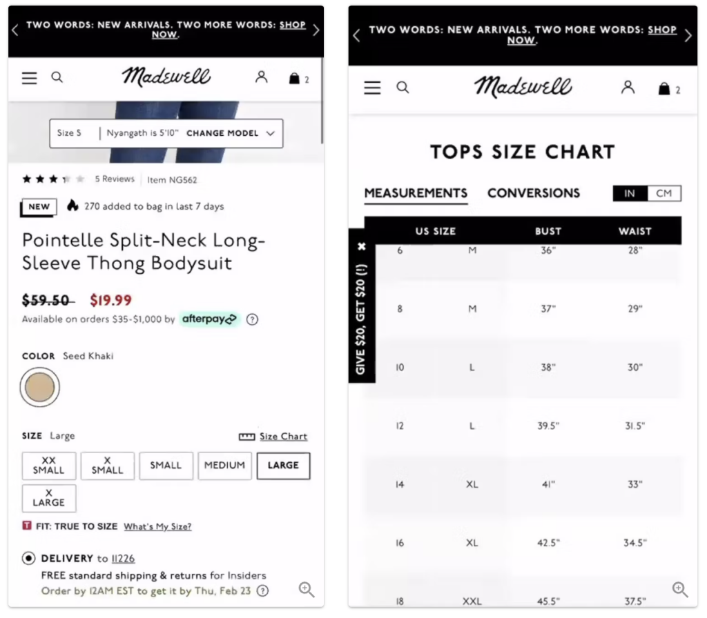
Example: Madewell handles size selection particularly well. One test participant choosing a bodysuit in size Large wanted to check whether it would fit and quickly found what she needed in the “Tops Size Chart”. Having confirmed that her size was a 12, she was able to validate her choice easily and add the item to the cart.
2. Make customer photos easy to browse
Many shoppers prefer to skim reviews looking for the specific detail they need rather than read each one end to end. The same applies to uploaded photos — buyers want to flick through all the images quickly to spot important details or confirm what the product is really like.
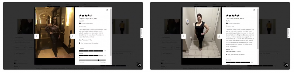
Example: Express has built a genuinely convenient way of browsing user photos. One test participant said:
“I just want to look at the reviews and the customer photos. Seeing the item on real people is really useful.”
3. Put size selectors somewhere obvious
Size has to be immediately accessible — burying it in a dropdown can cost you conversion.
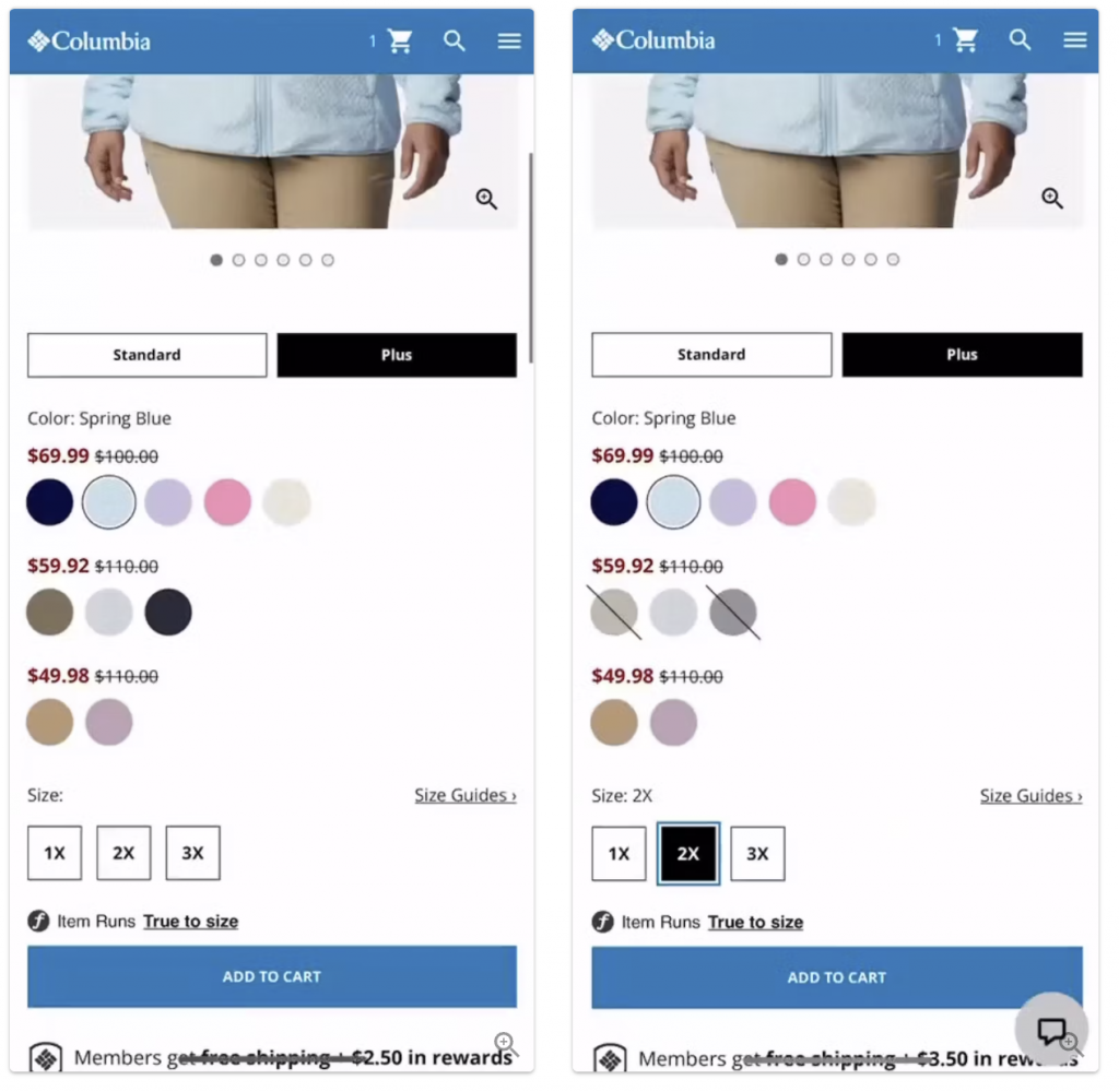
Example: Columbia Sportswear has built an intuitive size-selection UI. A test participant choosing a jacket in “Spring Blue” saw the available sizes instantly and picked “2X” without extra clicks. She could also see straight away which other colours were available in that size, which made the decision easier.
4. Show clothing on real people, in different contexts
How you present garment photography plays a decisive role in how easily shoppers understand the product and commit to buying it.
Usability testing shows that clothing shot flat on a white background does not convey fit or overall look. Users cannot judge how a dress will drape, how snug a pair of jeans or a shirt sits, or exactly where a skirt ends.
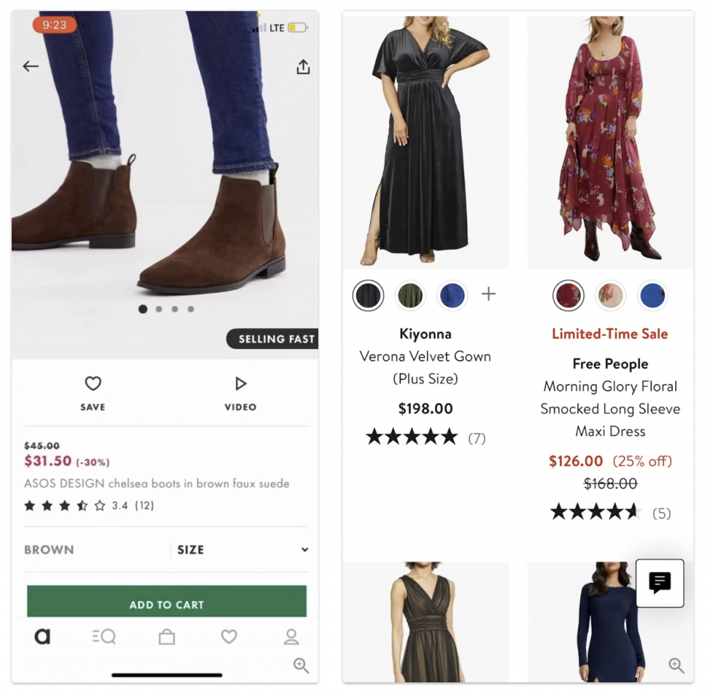
Example: Nordstrom helps shoppers judge length and fit by showing items on models. That lets buyers understand the product more precisely before purchase.
One test participant put it this way:
“The photos are great, there are nice close-ups, and you can see how the item looks on a person. That’s handy.”
📌 Next step: add shots of the same outfit on models of different heights and body types, the way Zara does. It helps shoppers picture how the garment will sit on them specifically.
5. Add a fit rating to reviews
Let reviewers state whether the item runs true to size (“runs small”, “true to size”, “runs large”). It removes a large chunk of the uncertainty around buying.

Example: Amazon makes heavy use of its “true to size” signal, which helps shoppers make a better-informed choice.
6. Add product videos
A photo does not always convey texture and fit. Short videos showing the fabric and the way the item sits help customers picture how it will look in real life.
Example: Net-a-Porter shows video of models in motion, so fabric and fit can be judged in movement.
7. Improve navigation and search filters
Good filters let people find the right product faster. Add filters by fabric, cut, style and even weather so shoppers can orient themselves more easily.
Example: Lululemon lets shoppers browse by activity (yoga, running, training), which makes choosing significantly easier.
Takeaway
Put these practices in place and you will not only improve the user experience — you will build customer loyalty, and that translates into higher conversion and sales growth.
This article is an adaptation of research by the Baymard Institute.